ShopDreamUp AI ArtDreamUp
Deviation Actions
Description
Image size
4000x3000px 7.73 MB
Make
FUJIFILM
Model
X10
Shutter Speed
1/25 second
Aperture
F/2.0
Focal Length
7 mm
ISO Speed
400
Date Taken
Mar 25, 2012, 4:25:21 PM
Sensor Size
17mm
Comments10
Join the community to add your comment. Already a deviant? Log In
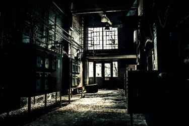
There are photos out there that I can't stop staring at. It can be because of the subject matter, how well the shot is taking, how stunning it is, or just how awesome it looks. I now have to make a new category; Places I would kill to go shoot in. This space falls into that new category. And the artists capture of it speaks volumes to my new found love of this category of staring.
The above and below aspect of this and the other photo is quite unique, and for once I get to rate a photo high on originality. I love getting a peak into separate worlds, it makes for an interesting experience.
The photo itself is nicely dark, which is quite fitting for the scene. And while the rest of the room looks great, there is one glaring spot of blown out white. It is the one light source, the sun outside. There is sadly not much that could have been done, except for shooting this in quite a few exposures and post processing it into an HDR image. While I can't stand blown out areas for the most part, I would look past it in this image if the artist had done a bit of work to reduce the local brightness of the light spot on the wall behind the opening, which is also blown out.
The color in this photo is perfect though, with the walls and floors looking interesting, the color drawing your attention back and forth. The refuse on the ground below the opening also serving to add some interesting color contrast to the photo.
The composition in the photo is quite nice as well, with the ladder coming down from the opening near dead center between the support columns, and the columns themselves being almost perfectly centered in the image itself. My only little niggles are the same minor ones I have far too often, with my OCD noticing the photo being just so slightly off kilter. But it is almost too little to even be worth mentioning. But there is a bit of Barrel Distortion caused by the lens, which also causes my eyes to perceive a bit of rotation to the photo. Its something that can easily be corrected, but almost most people won't even notice it.
The photo all in all is done brilliantly, and while I personally would have gone for HDR just to stop the blown out whites, the photo is still wonderful and the artist has done a great job with this capture.


